

Chart Guide Beginner
Reading a price chart is the first real skill every new trader and investor needs to build. A chart is simply a picture of buyers and sellers fighting for control of the price, and once you learn to read that picture, the stock market stops feeling random. This Chart Guide Beginner article explains, in simple language, how to read a stock chart, the most useful candlestick patterns, the technical indicators every beginner should know, how support and resistance work, and how to actually use TradingView to put all of this into practice. By the end of this guide you will be able to open any chart — on TradingView, your broker app, or anywhere else — and understand exactly what the price is trying to tell you.

Whether you are learning how to read stock charts for beginners, searching for the best candlestick patterns to learn first, or simply trying to understand what a moving average or RSI indicator actually means, this guide brings everything together in one place. Most beginners get overwhelmed because they try to learn every indicator at once. The smarter approach — and the one used throughout this guide — is to master one concept at a time: first the chart itself, then candles, then indicators, then support and resistance, and finally a real platform like TradingView where you can practice everything you learn for free.
1. How to Read a Stock Chart for Beginners
Understanding price, time, volume, and the basic structure every chart is built on.
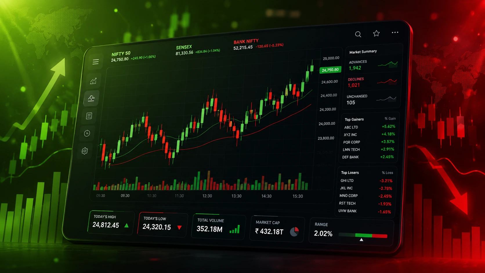
Every stock chart is built from three simple pieces of information: price on the vertical axis, time on the horizontal axis, and volume shown as bars underneath the main chart. Price tells you where the stock has traded, time tells you when it happened, and volume tells you how strongly the market reacted to that move. A beginner looking at a chart for the first time should always start by checking the time frame — daily, weekly, or intraday — because the same stock can look completely different depending on whether you are viewing one day of trading or one year.
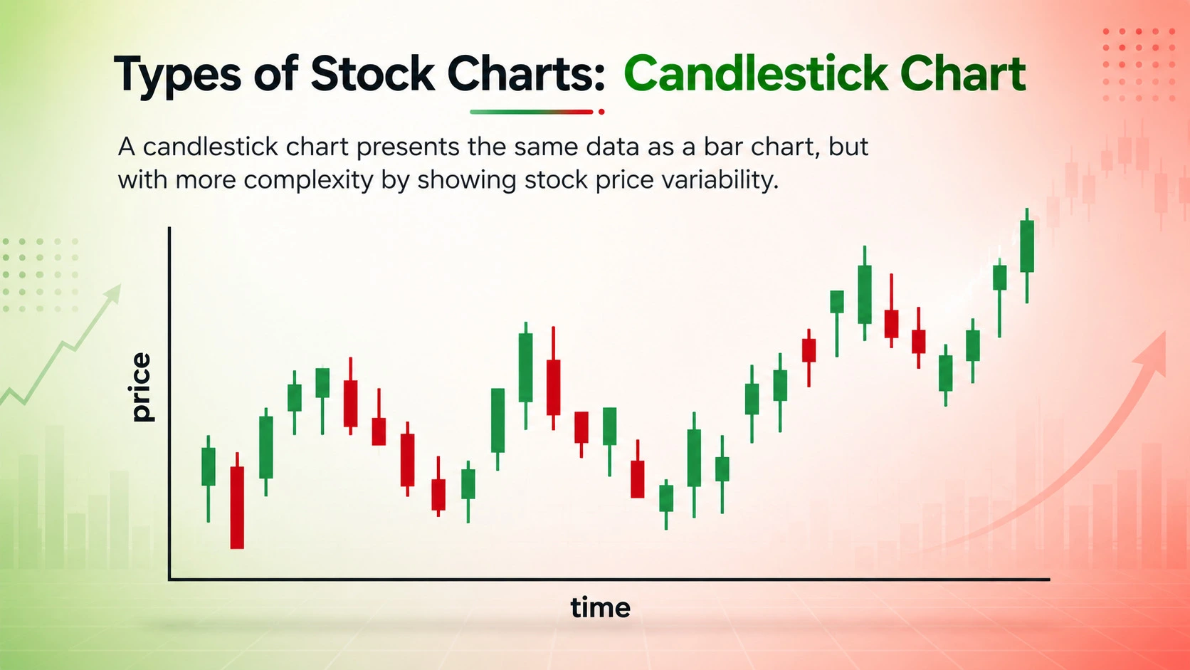
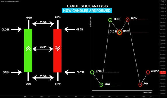
Most charting platforms offer three main chart types: line charts, bar charts, and candlestick charts. A line chart simply connects the closing prices and is good for spotting the overall trend quickly. A candlestick chart, on the other hand, shows the open, high, low, and close (OHLC) for every period, which gives far more detail about who was in control — buyers or sellers — during that session. This is why almost every serious trader, beginner or advanced, eventually switches to candlestick charts as their primary tool for chart reading.
Once you are comfortable identifying the time frame and chart type, the next step is learning to read the overall trend direction. A series of higher highs and higher lows usually signals an uptrend, while a series of lower highs and lower lows signals a downtrend. Sideways movement, where price stays within a horizontal range, is called consolidation. Recognising these three basic trend conditions is the foundation for every other concept covered later in this guide, including candlestick patterns, indicators, and support and resistance levels.

— Why Beginners Should Start With Candlestick Charts —
Many beginners ask which chart type is best to learn first, and the honest answer is the candlestick chart. Unlike a plain line chart, every single candle on a candlestick chart tells a complete mini-story of that period's trading session — the opening price, the highest price reached, the lowest price reached, and where the price finally closed. This single piece of information is what powers candlestick pattern reading, which is covered in detail in the next section of this guide.
2. Candlestick Patterns Every Beginner Should Know
Doji, Hammer, Engulfing, and Morning Star — the patterns beginners search for most.
Candlestick patterns are one of the most searched topics by new traders because they offer a visual, easy-to-spot way of predicting potential reversals or continuations in price. A single candle, or a small group of candles, can reveal whether buyers or sellers are gaining strength. The most beginner-friendly candlestick patterns to learn first are the Doji, the Hammer, the Bullish and Bearish Engulfing patterns, and the Morning Star and Evening Star formations, because these patterns appear frequently and are relatively easy to identify once you know what to look for.
A Doji forms when the open and close prices are almost identical, creating a very small body with wicks on either side. This pattern signals indecision in the market — neither buyers nor sellers were able to take control during that session. A Hammer, on the other hand, has a small body near the top of the candle with a long lower wick, and it usually appears after a downtrend, suggesting that sellers pushed the price down but buyers stepped in strongly enough to push it back up by the close. This is often read as an early sign of a possible bullish reversal.
Engulfing patterns are two-candle formations that beginners are encouraged to learn early because of how reliable they tend to be. A Bullish Engulfing pattern happens when a small red candle is followed by a larger green candle that completely covers the body of the previous candle, signalling that buyers have overwhelmed sellers. A Bearish Engulfing pattern is the exact opposite — a small green candle followed by a larger red candle — and it often signals that sellers are taking control after a period of buying. The Morning Star and Evening Star are three-candle patterns that work in a similar way but are generally considered stronger reversal signals because they require confirmation from a third candle.
— Why Volume Confirmation Matters With Candlestick Patterns —
No candlestick pattern should ever be trusted in isolation. A Hammer or Bullish Engulfing pattern that forms on very low trading volume carries far less weight than the same pattern forming on high volume, because volume reflects how many market participants actually agreed with that price move. This is why experienced chart readers always check the volume bar beneath a pattern before deciding whether it is a genuine signal or simply market noise.
3. Technical Indicators Every Beginner Should Learn
Moving Average, RSI, MACD, and Bollinger Bands explained in simple terms.
Technical indicators are mathematical calculations applied to price and volume data, and they help beginners confirm what the chart is already showing instead of trying to guess. The most searched and most useful indicators for beginners are the Moving Average, the Relative Strength Index (RSI), the MACD (Moving Average Convergence Divergence), and Bollinger Bands. Learning these four indicators thoroughly is far more useful than trying to add ten different indicators to a single chart, which usually leads to confusion rather than clarity.
A Moving Average smooths out price data over a chosen number of periods — commonly 20, 50, or 200 days — to reveal the underlying trend direction without the noise of daily price swings. When a shorter moving average crosses above a longer one, it is often called a Golden Cross and is read as a bullish signal; the opposite crossover is called a Death Cross and is read as bearish. The RSI, or Relative Strength Index, measures the speed and strength of recent price moves on a scale of 0 to 100. A reading above 70 generally suggests a stock is overbought, while a reading below 30 suggests it may be oversold, although beginners should remember that strong trends can keep an RSI in extreme territory for a long time.
The MACD indicator shows the relationship between two moving averages and is widely used to spot momentum shifts through line crossovers. Bollinger Bands consist of a moving average with two bands plotted above and below it based on price volatility; when the bands squeeze together tightly, it often signals that a big price move is building up, and when they expand, it signals that volatility is increasing. Beginners are generally advised to start with just two or three indicators — typically a moving average paired with either RSI or MACD — and add volume as a confirming tool, rather than overcrowding the chart with every indicator available.

— Choosing the Right Indicator Combination —
There is no single "best" indicator, and that is one of the most important lessons for any beginner studying technical analysis. A trend-following trader may rely heavily on moving averages, while a momentum trader may lean on RSI and MACD. The goal is to choose indicators that match your trading style and time frame, then practice reading them alongside price action and volume until the signals become second nature rather than confusing noise on the screen.
4. Support and Resistance Levels Explained
The most important price zones every chart reader must learn to identify.
Support and resistance are two of the most fundamental concepts in chart reading, and almost every other tool covered in this guide — candlestick patterns, indicators, and trend lines — works best when combined with them. Support is a price level where a falling stock has historically found buying interest strong enough to stop the decline and bounce back up. Resistance is the opposite — a price level where a rising stock has historically met enough selling pressure to stop the advance and pull back down. Beginners often describe these levels as a "floor" and a "ceiling" for price.
Identifying support and resistance is mostly about studying the history of a chart and marking horizontal lines at points where price has reversed direction more than once. The more times a level is tested without breaking, the more significant that level becomes to other chart readers, which in turn often makes the level even stronger because more traders are watching it. When price finally does break through a strong resistance level, that old resistance frequently becomes the new support level going forward — and the same idea applies in reverse when support is broken.
Volume plays a major role in confirming the strength of a support or resistance break. A breakout above resistance on high trading volume is considered far more reliable than the same breakout on weak, low volume, which is sometimes called a "false breakout" or a "fakeout." Combining support and resistance zones with the candlestick patterns from section two and the indicators from section three gives beginners a much more complete and confident way of reading any chart, rather than relying on a single tool in isolation.
— Trend Lines and Breakouts —
Beyond horizontal support and resistance, diagonal trend lines connecting a series of rising lows or falling highs can also act as dynamic support or resistance. A break of a well-respected trend line, especially when paired with strong volume, is one of the most commonly searched breakout signals among beginner traders learning price action.
5. How to Use TradingView for Chart Analysis — Step-by-Step Guide
A beginner-friendly walkthrough of setting up charts and indicators on TradingView.
TradingView is the most widely used charting platform among beginner and professional traders alike, mainly because it is free to start with, works directly in the browser, and gives access to every concept covered in this guide — candlestick charts, indicators, and drawing tools for support and resistance — in one place. Learning to use TradingView properly is one of the fastest ways for a beginner to move from reading about charts to actually practising chart reading in real time.
After creating a free TradingView account, the first step is searching for a stock or index symbol in the search bar at the top of the screen, which instantly loads its live price chart. From there, switching the chart type to "Candles" from the chart-type icon turns the display into a candlestick chart, which, as explained earlier in this guide, gives far more detail than a simple line chart. The time frame selector at the top of the chart lets you switch between intraday views, like 5-minute or 15-minute charts, and longer views like daily, weekly, or monthly charts.
Adding indicators on TradingView is done through the "Indicators" button found along the top toolbar. Typing "Moving Average," "RSI," "MACD," or "Bollinger Bands" into the search box instantly applies that indicator to the chart, and each one can be customised — for example, changing the moving average period from 50 to 200 days. Drawing support and resistance lines is just as simple: selecting the horizontal line tool from the left-hand drawing toolbar and clicking on a previous price swing lets you mark a level directly on the chart, exactly as described in section four of this guide.
— Step-by-Step Process to Set Up a Chart on TradingView —
- Create a free TradingView account and search for your stock or index symbol.
- Switch the chart type to "Candles" to view full open, high, low, and close data.
- Select your preferred time frame — intraday, daily, weekly, or monthly.
- Open the "Indicators" panel and add a Moving Average, RSI, or MACD.
- Use the horizontal line tool to mark key support and resistance levels.
- Use the trend line tool to connect swing highs or swing lows where relevant.
- Save your chart layout so your indicators and drawings load automatically next time.
- Practice daily on different stocks to build real chart-reading confidence over time.